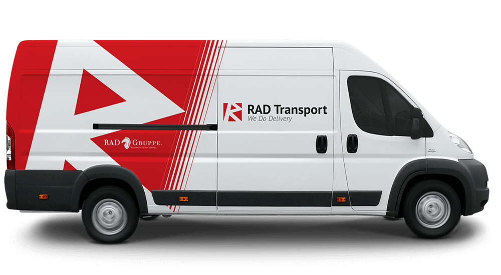
For this Austrian Company, I created new fresh look, brand architecture and promotion activities. I created a logo, tag line, build web architecture, UX, UI, stationery design, rt Direction, responsive design, and iconography. Rad Gruppe is the name of the umbrella company and Rad Transport is a daughter company.
Since they are in transportations business I created a platform that was inspired by the google maps and road cross-sections. The main inspiration was an Austrian precision, dedication and time awareness.
Each one of the drivers is very dedicated and passionate about their work, so used the Austrian red color, and in multilevel branding communication, I applied on every touch point creating a meaningful brand experience. Austrians are laser-focused people. That is how they operate.
Tag line is: We do delivery.